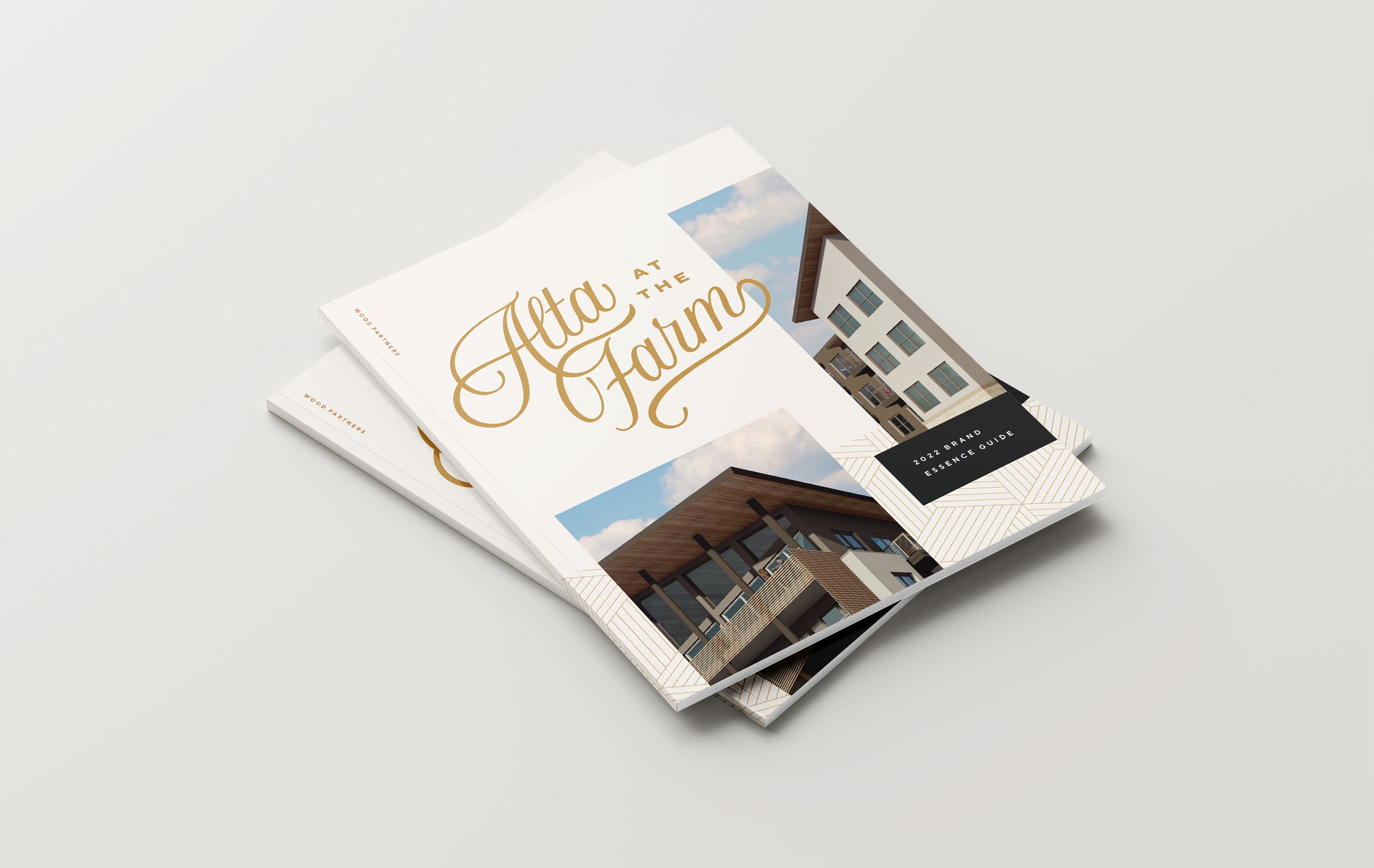
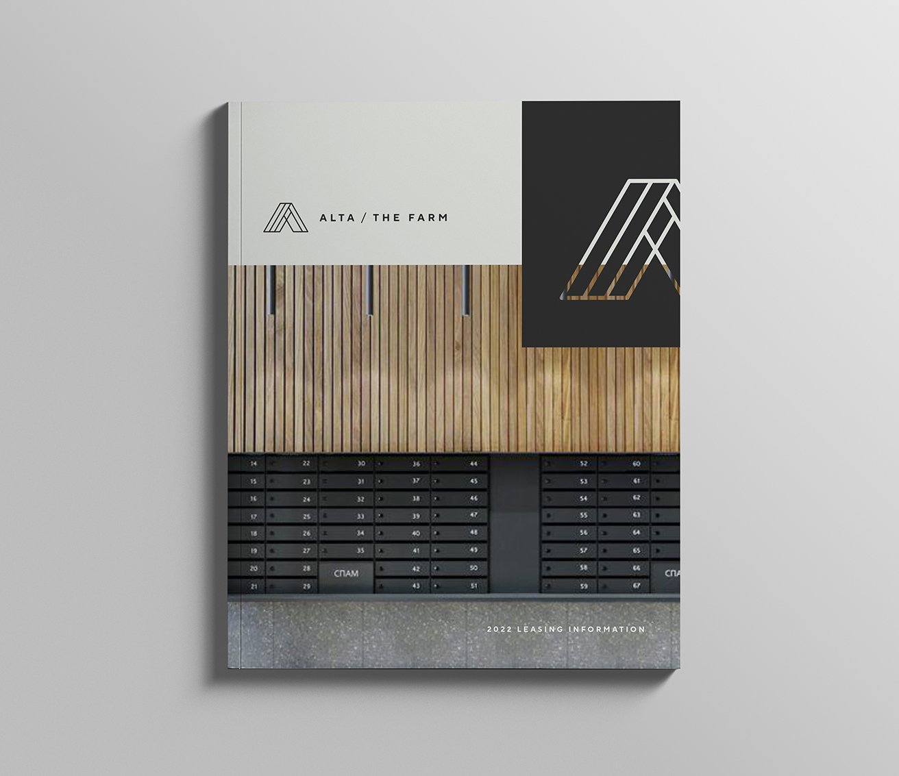
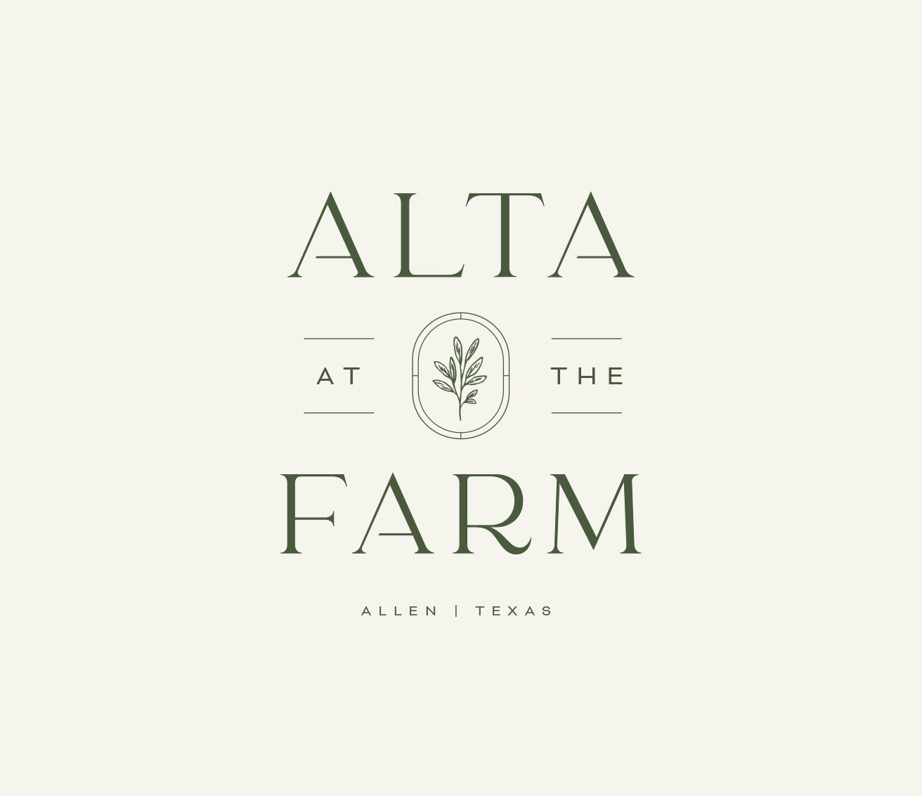
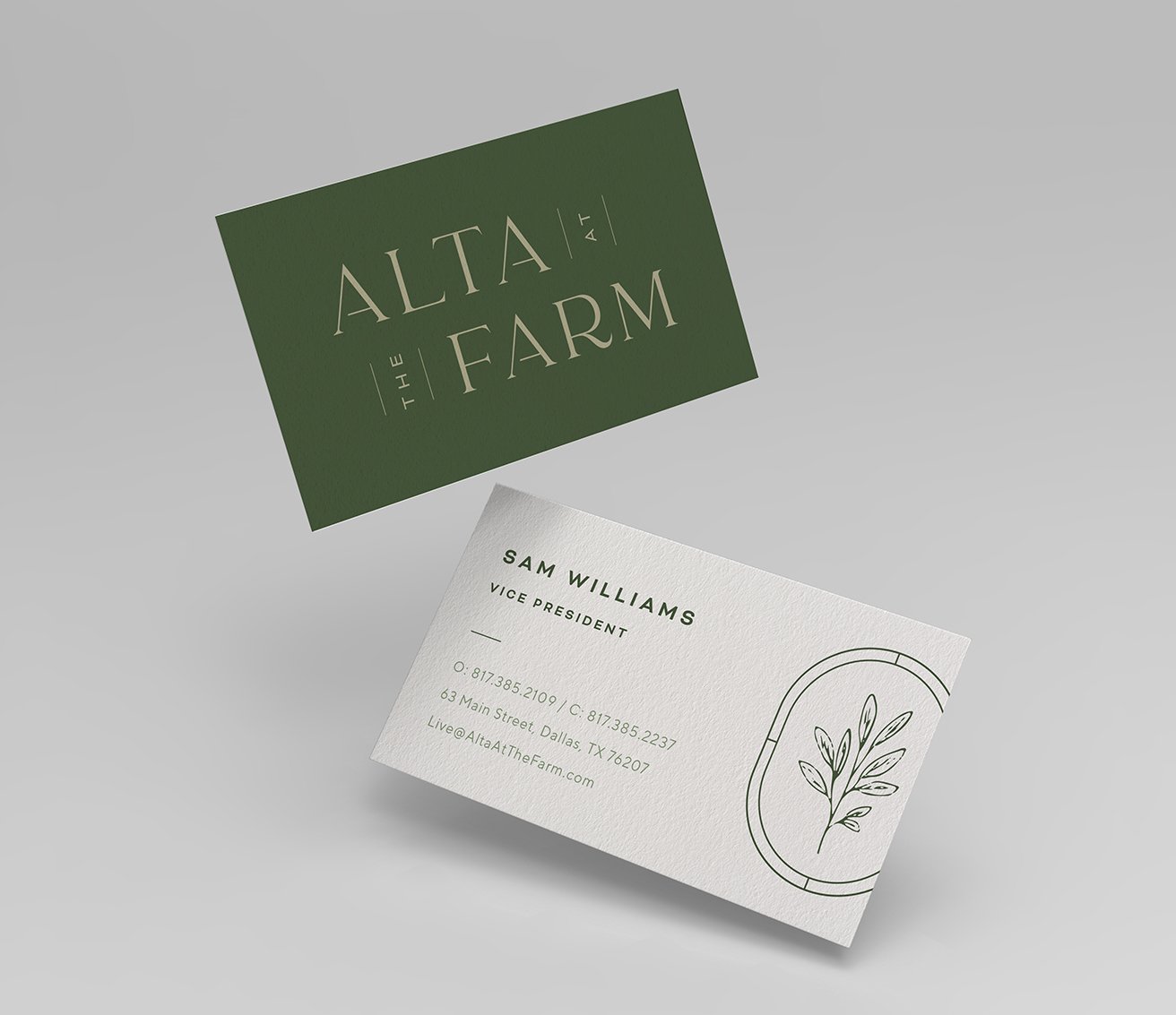
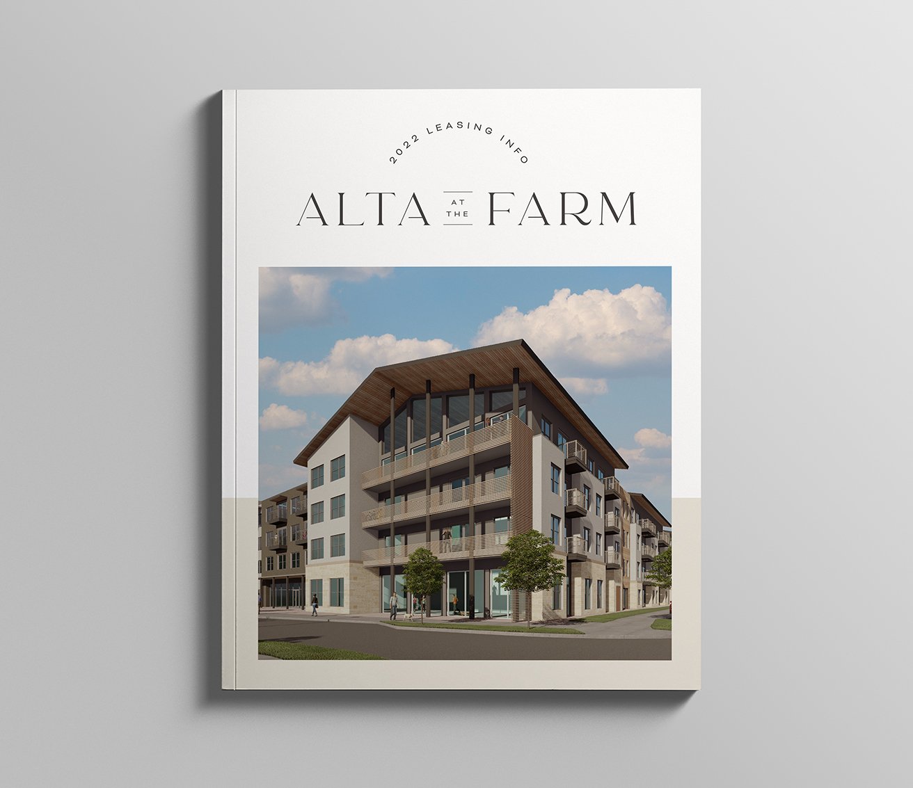
Alta at The Farm: Branding
—
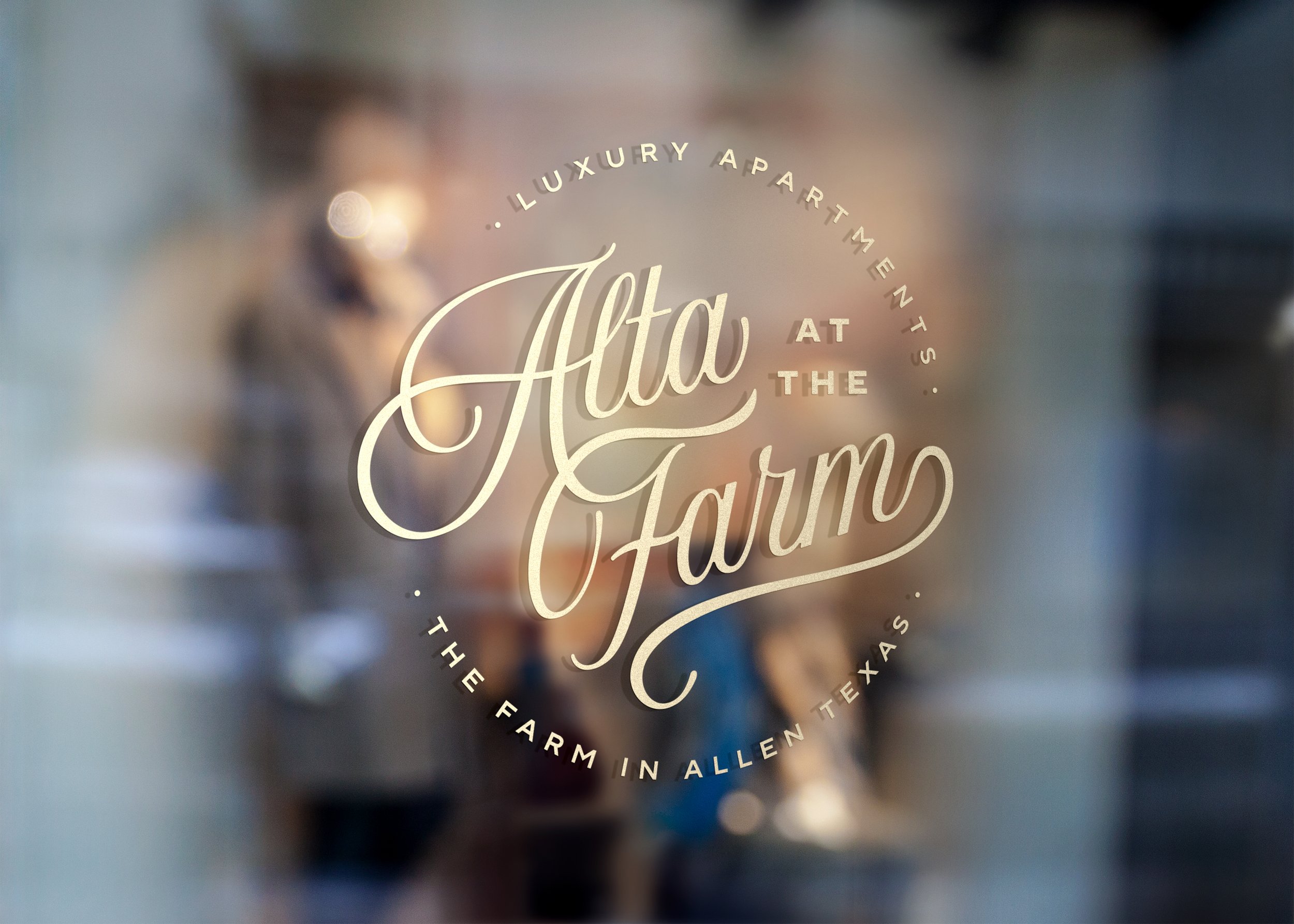
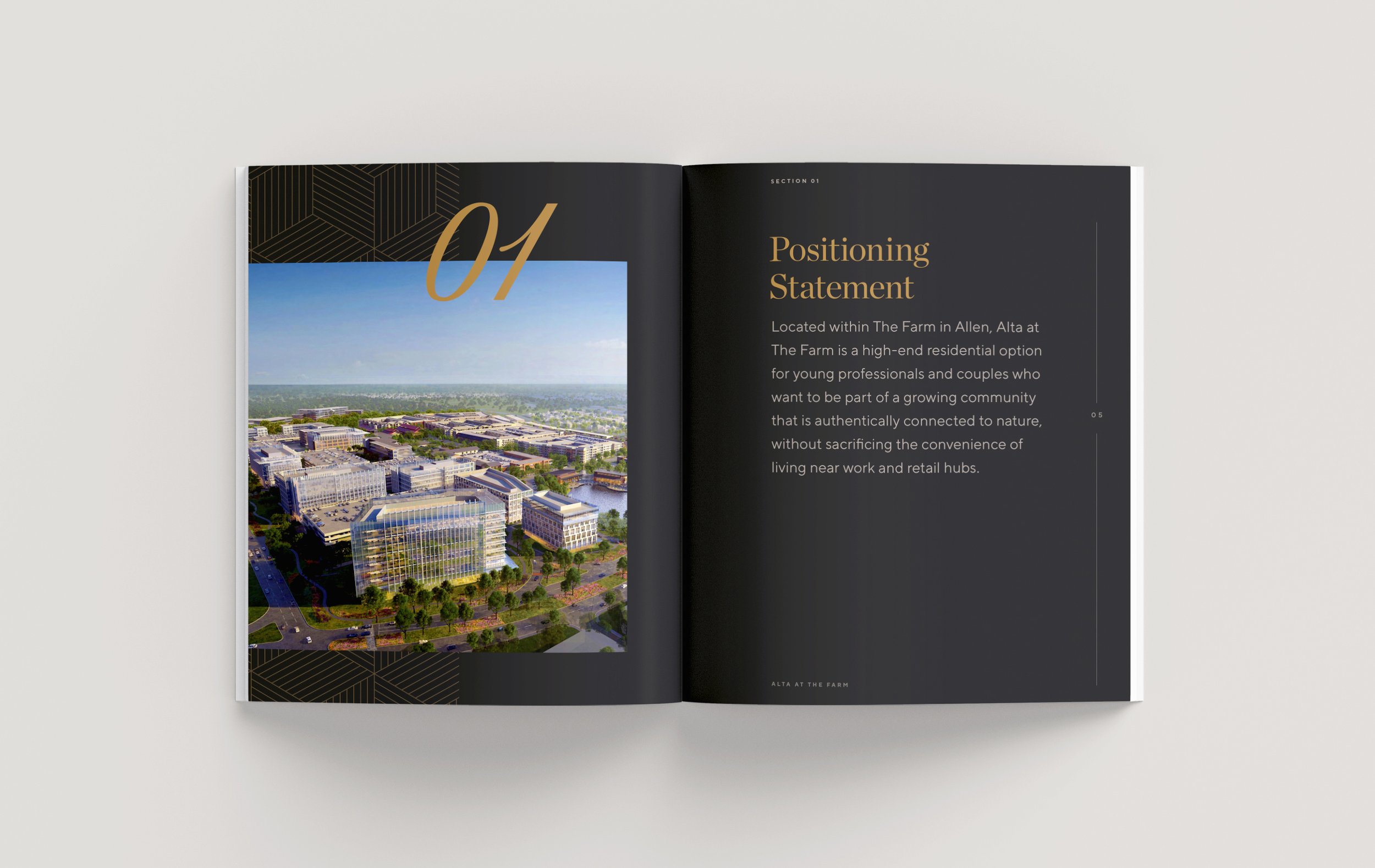
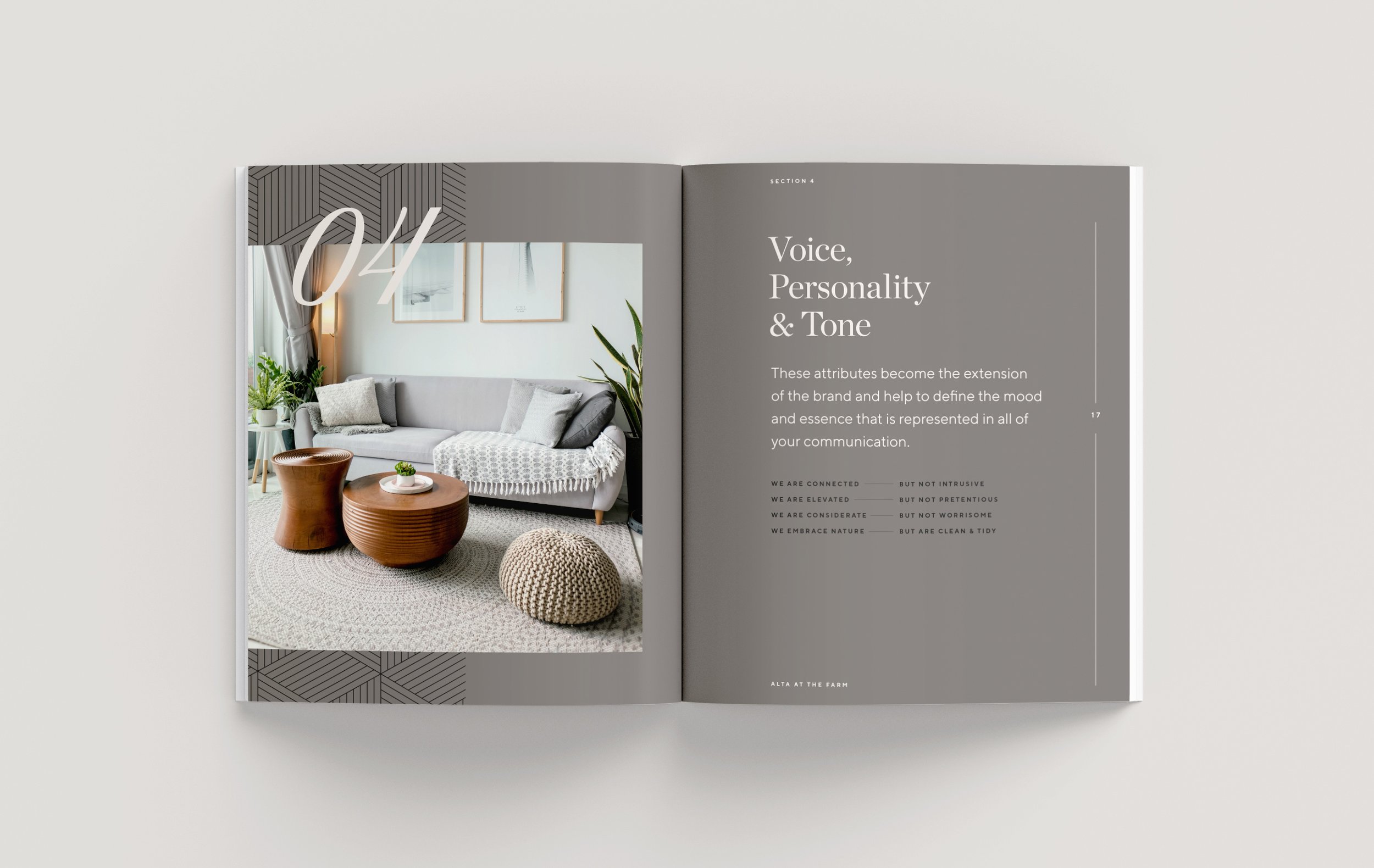
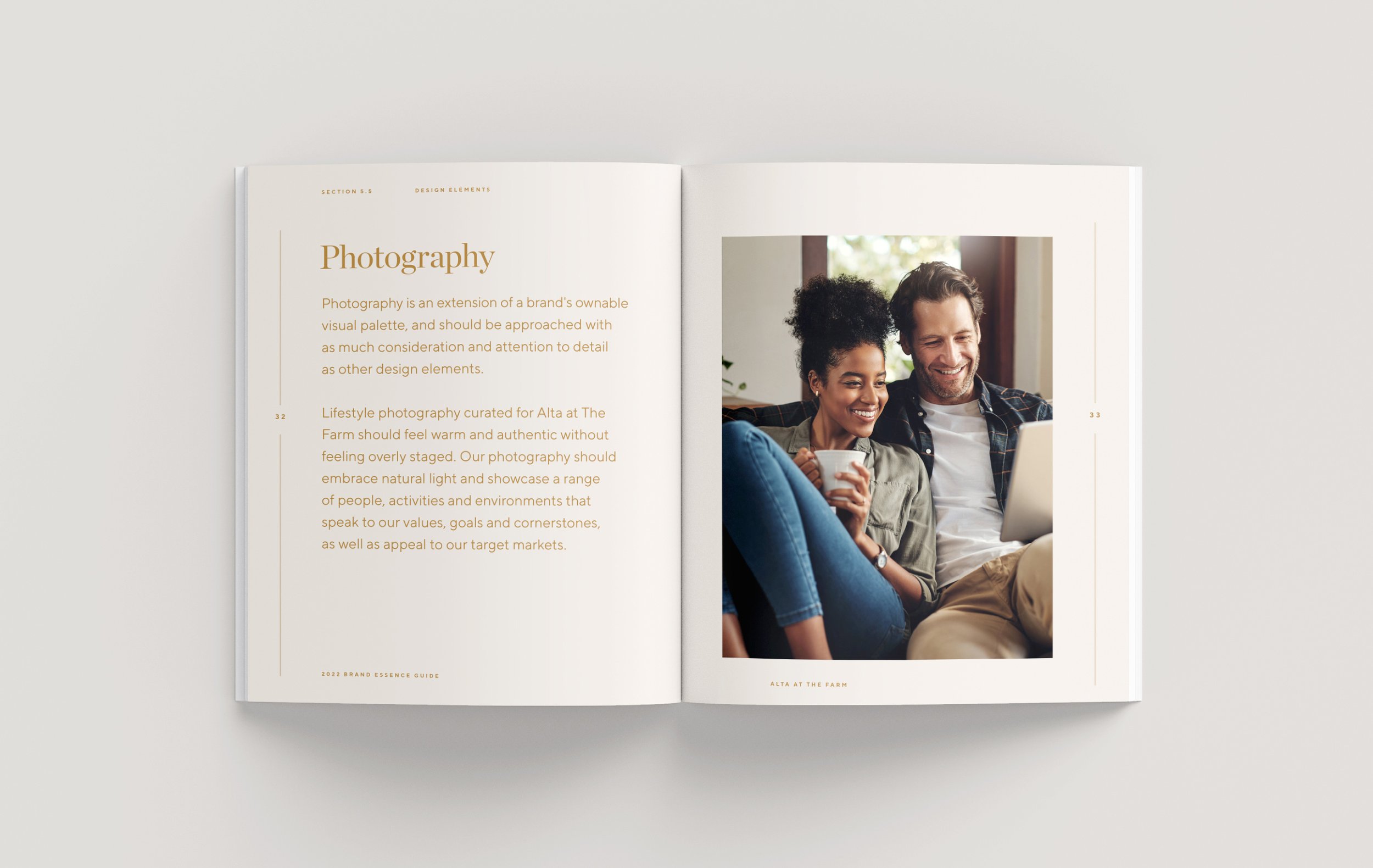
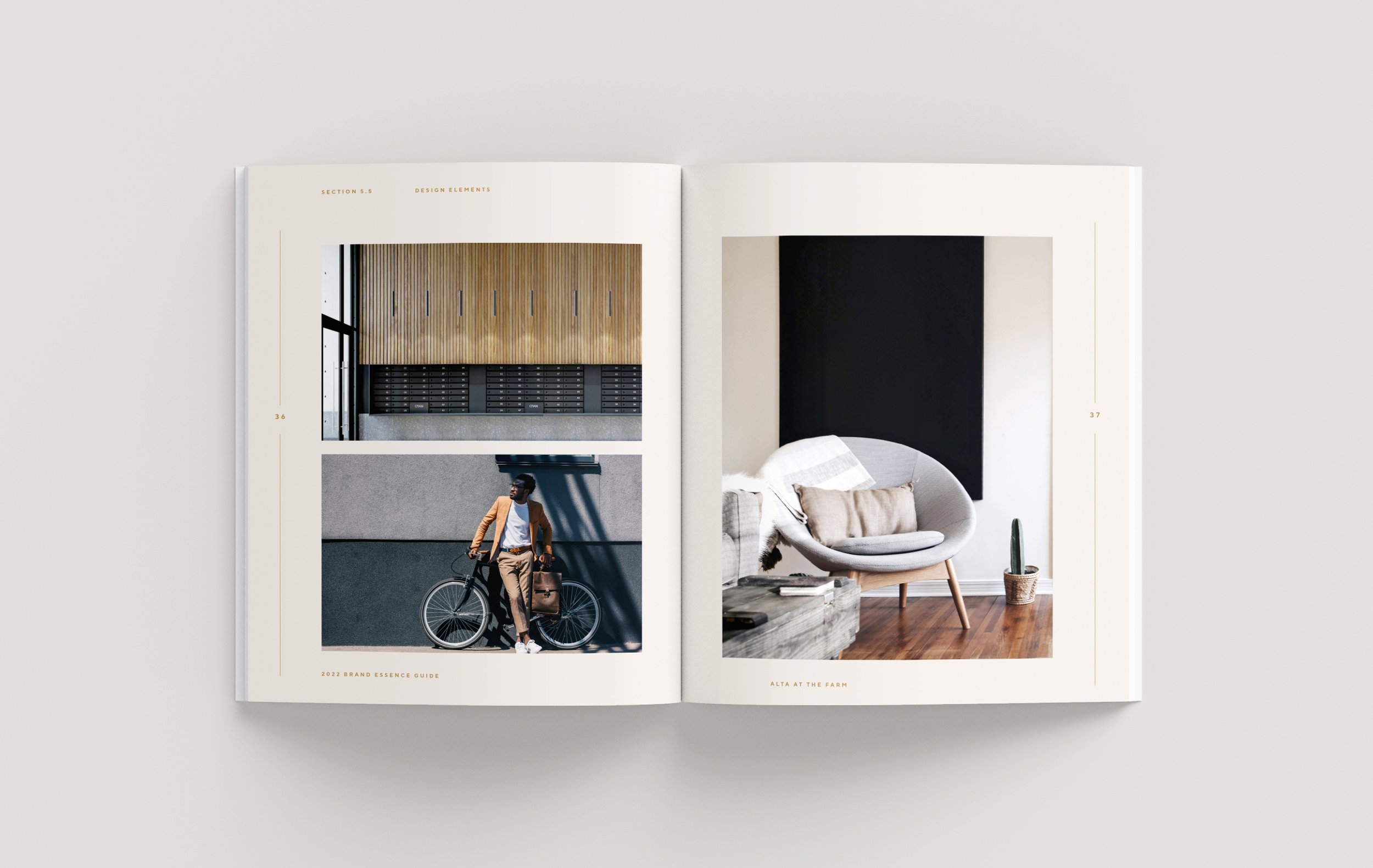
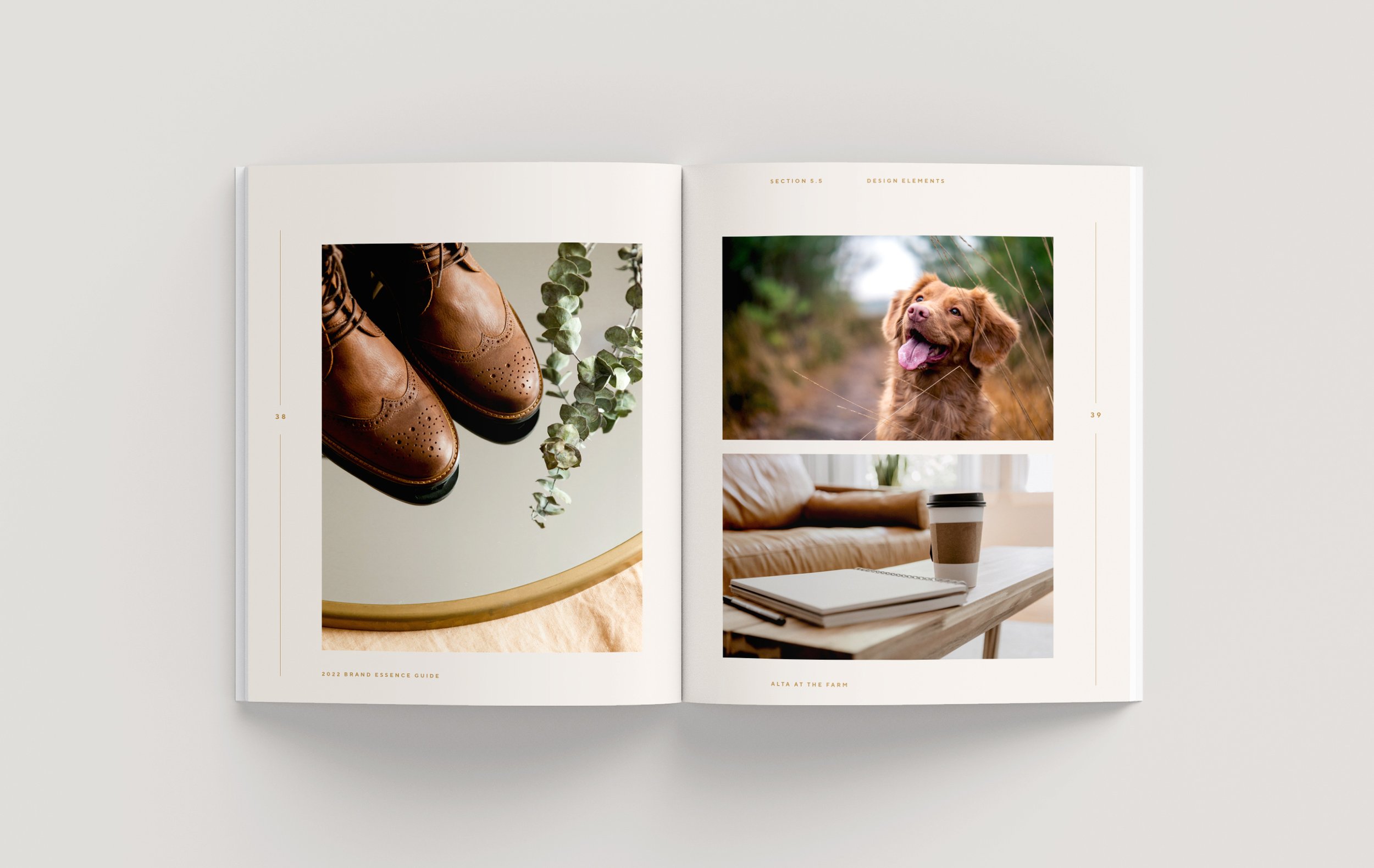
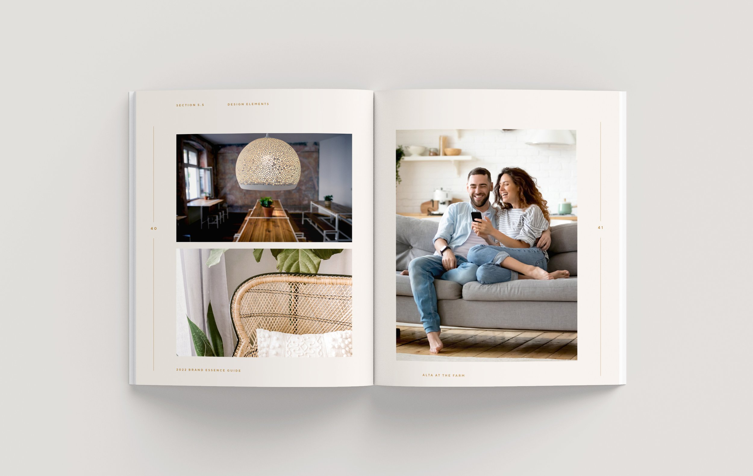
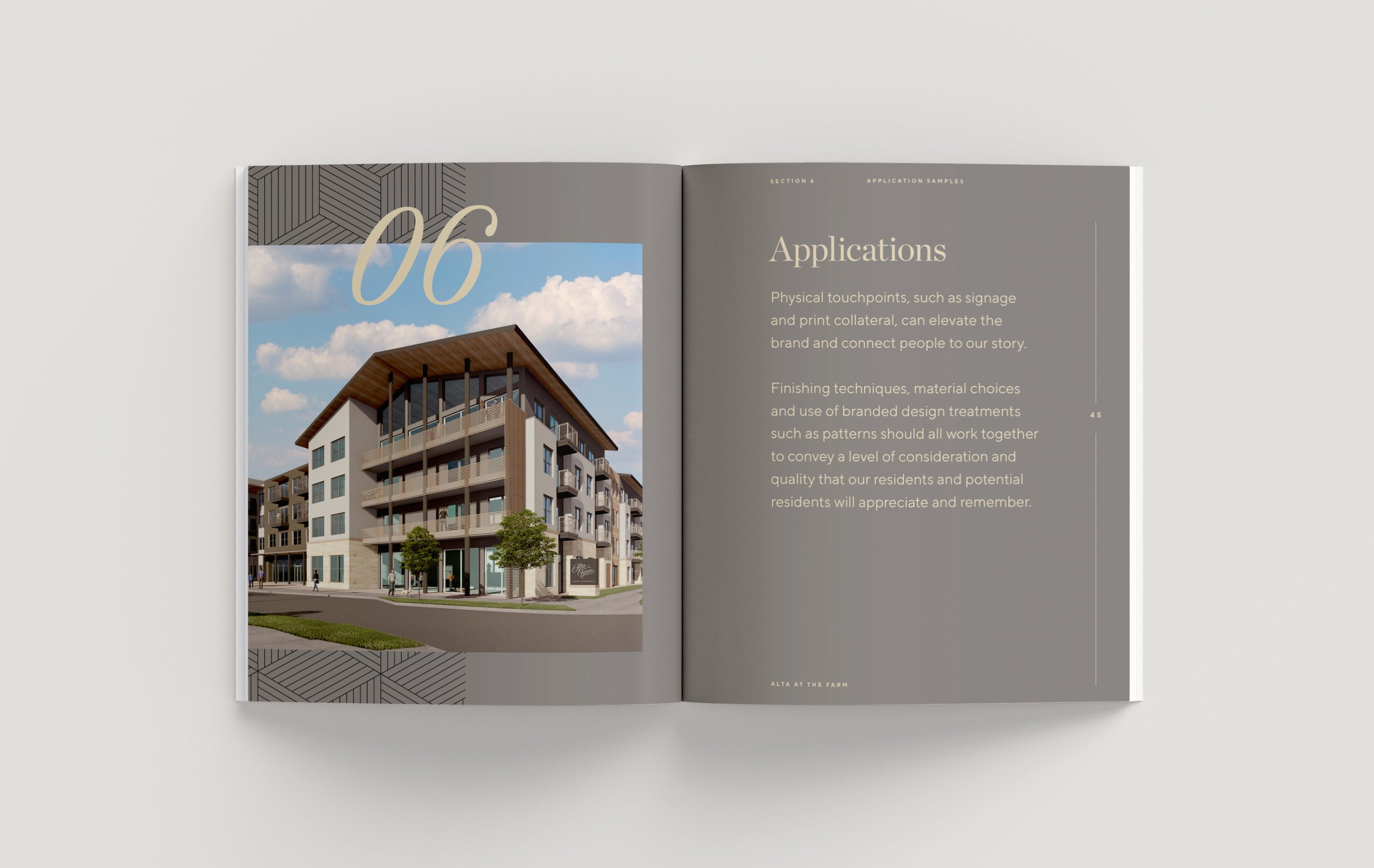
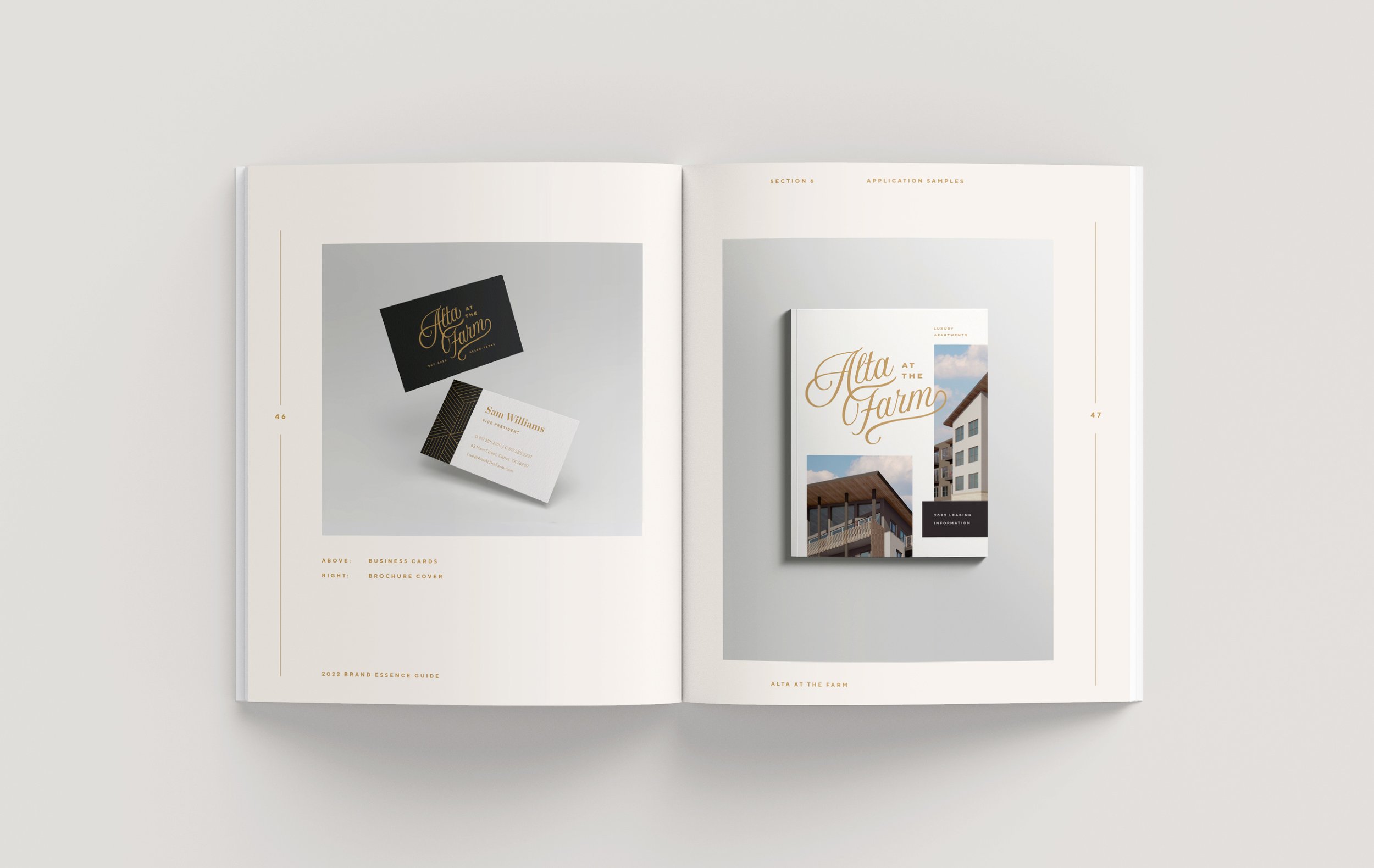
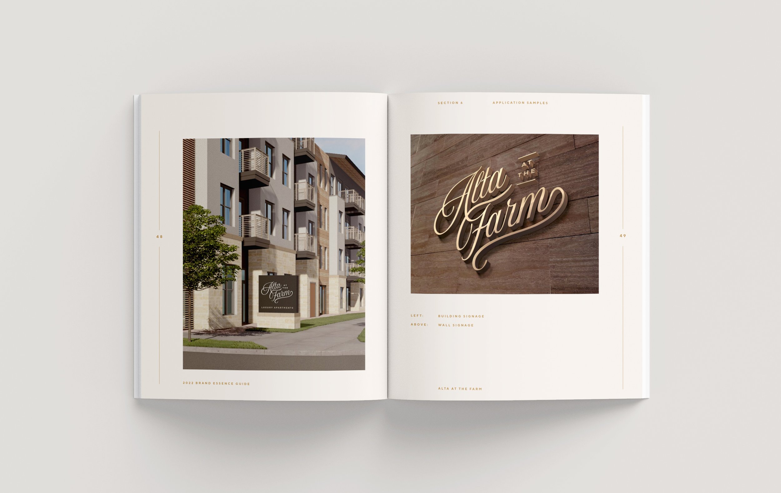
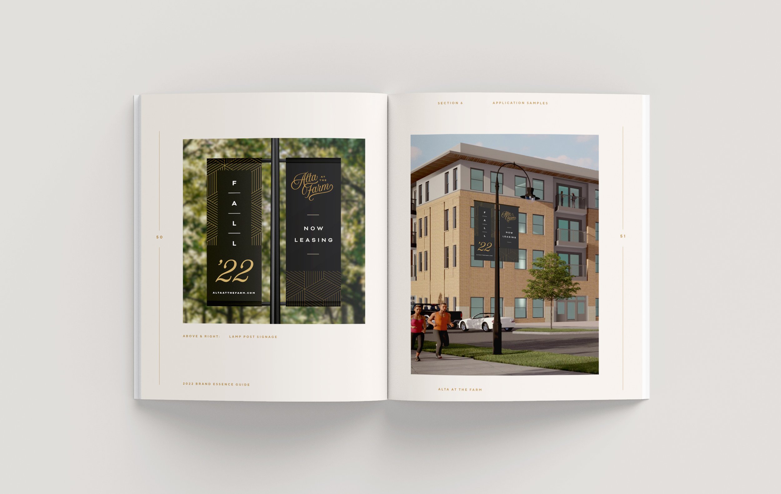
An identity system designed for a new apartment complex located in North Texas, nestled within The Farm community. Leaning into the notion of curation, this identity aims to bring a sense of warmth and nostalgia to the modern, nature-inspired interiors—positioning Alta as a unique and inviting place to live.
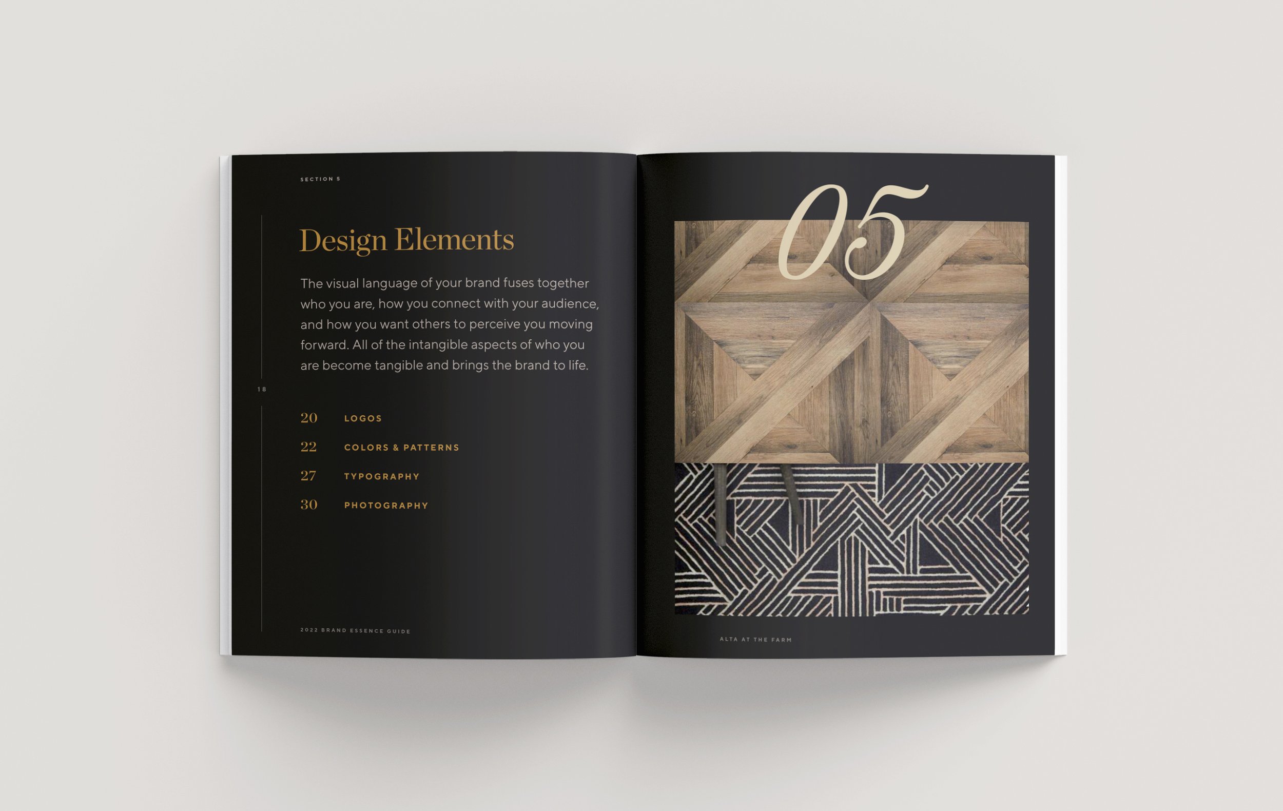
The Concept & Buildout
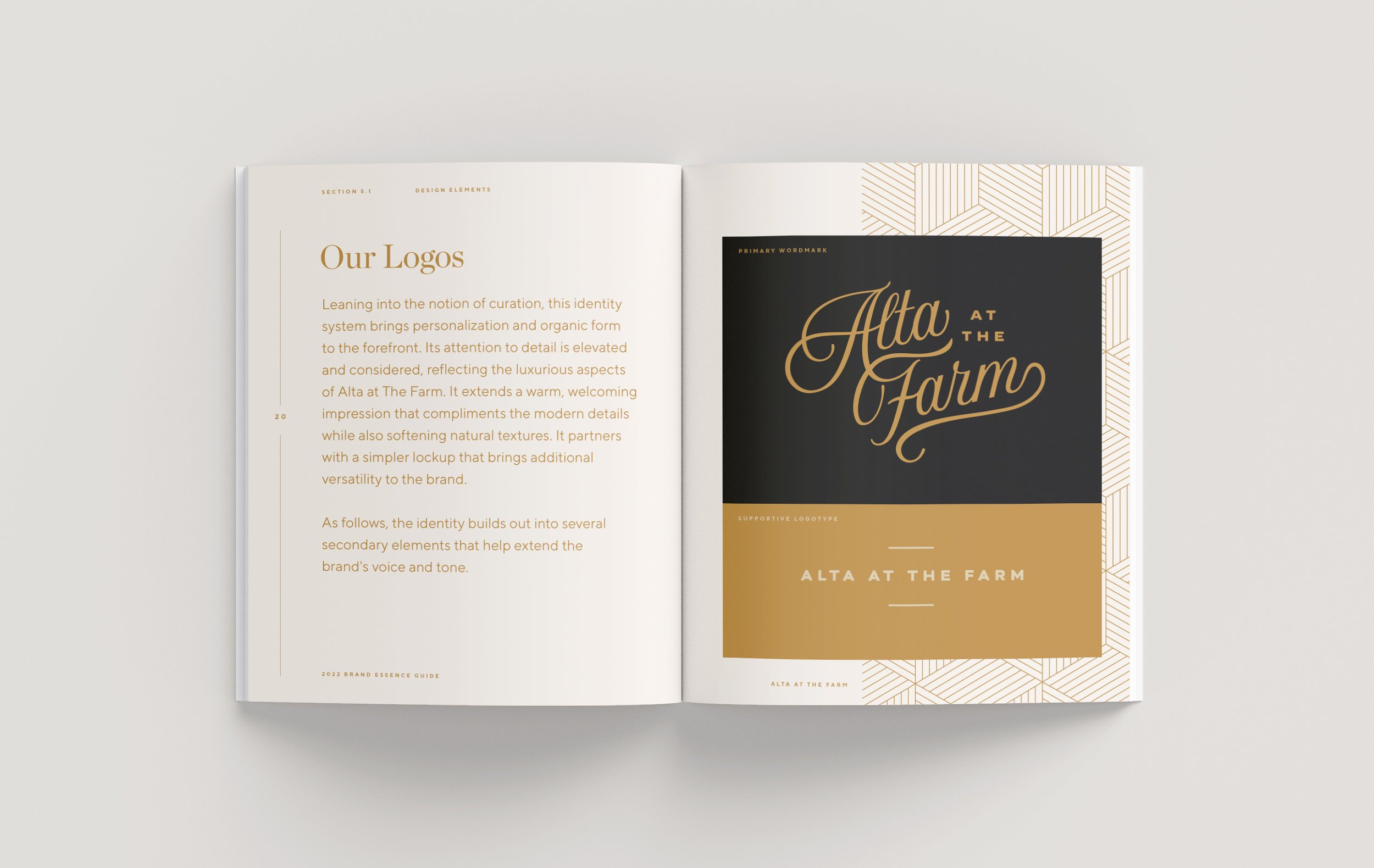
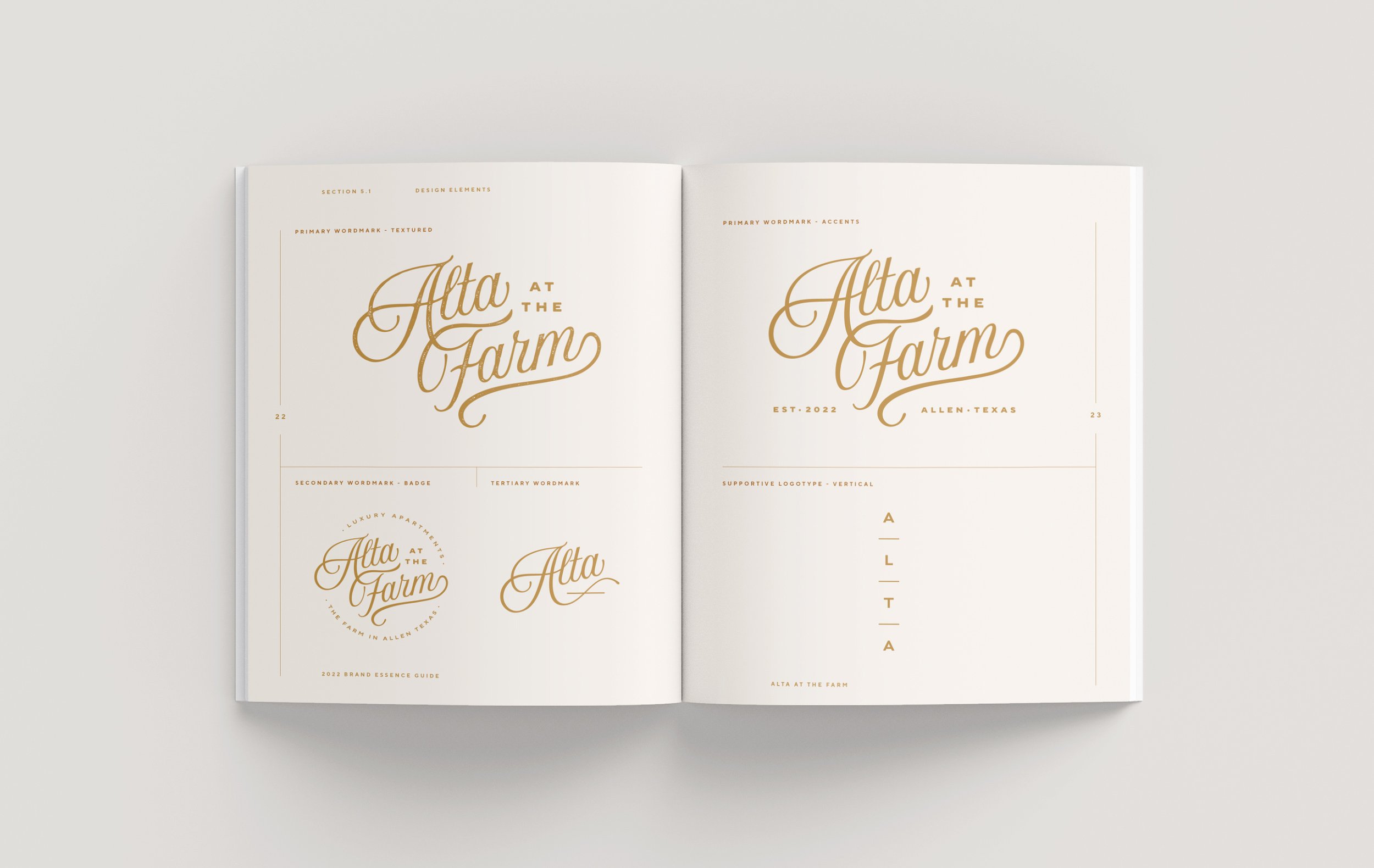
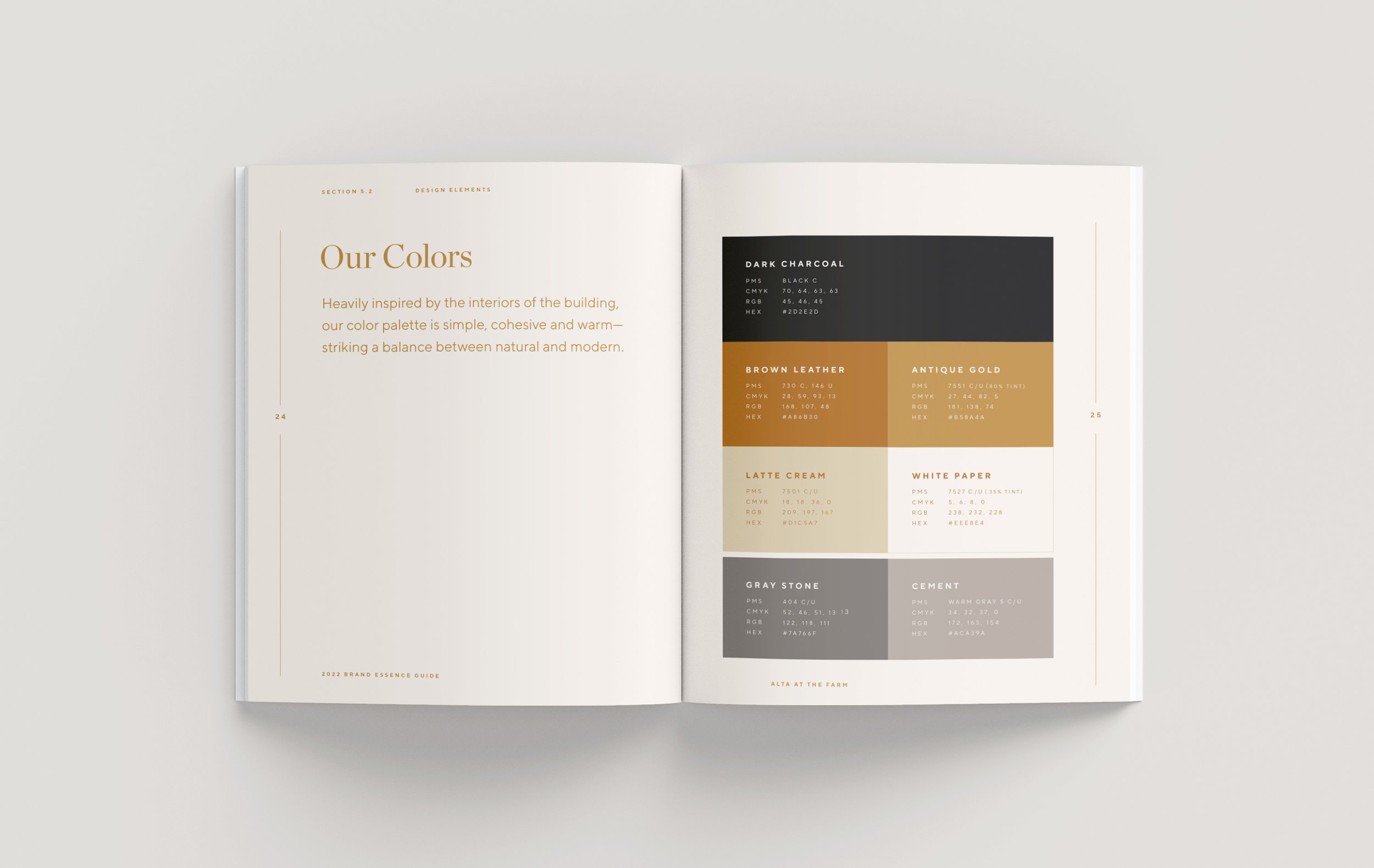
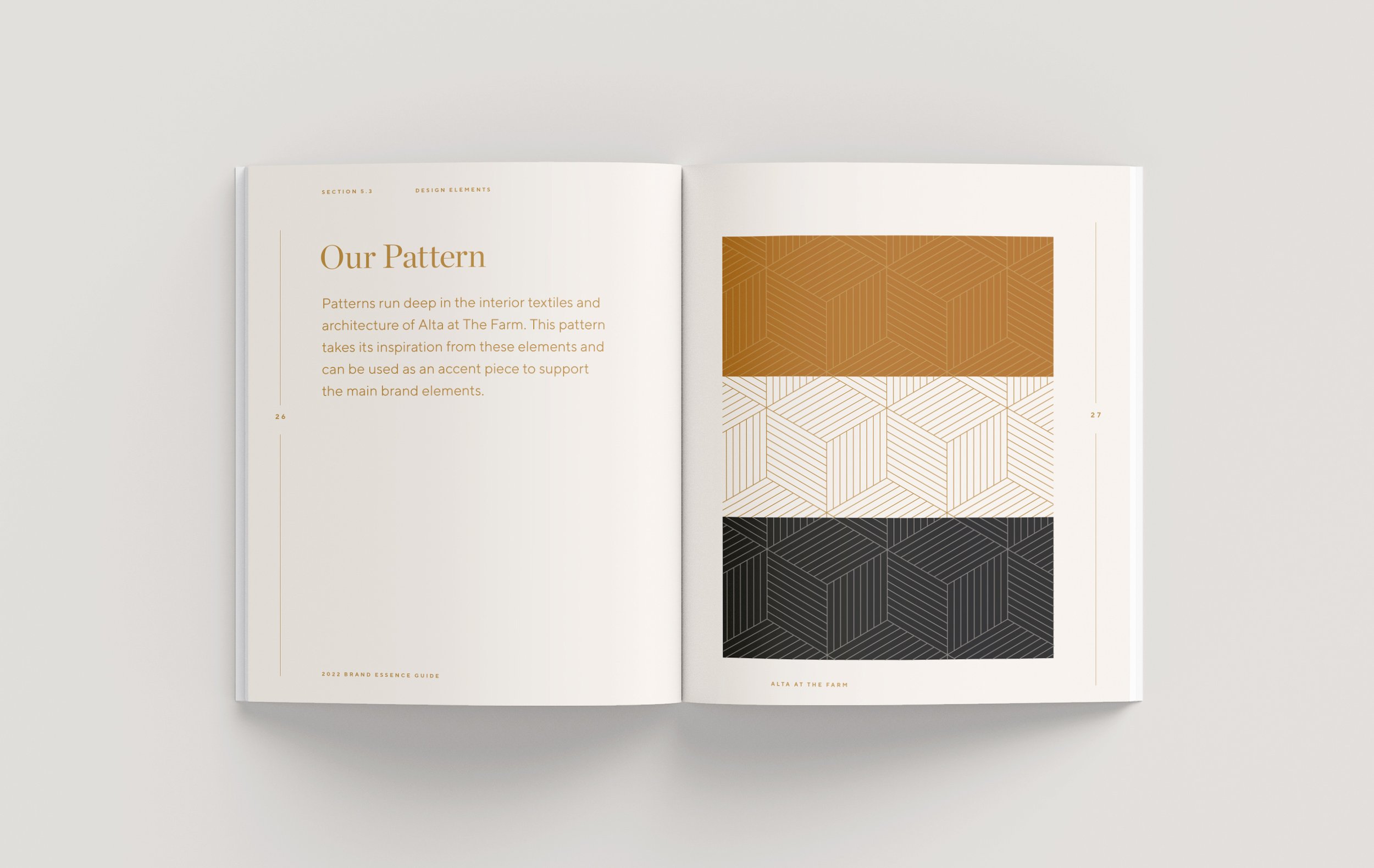
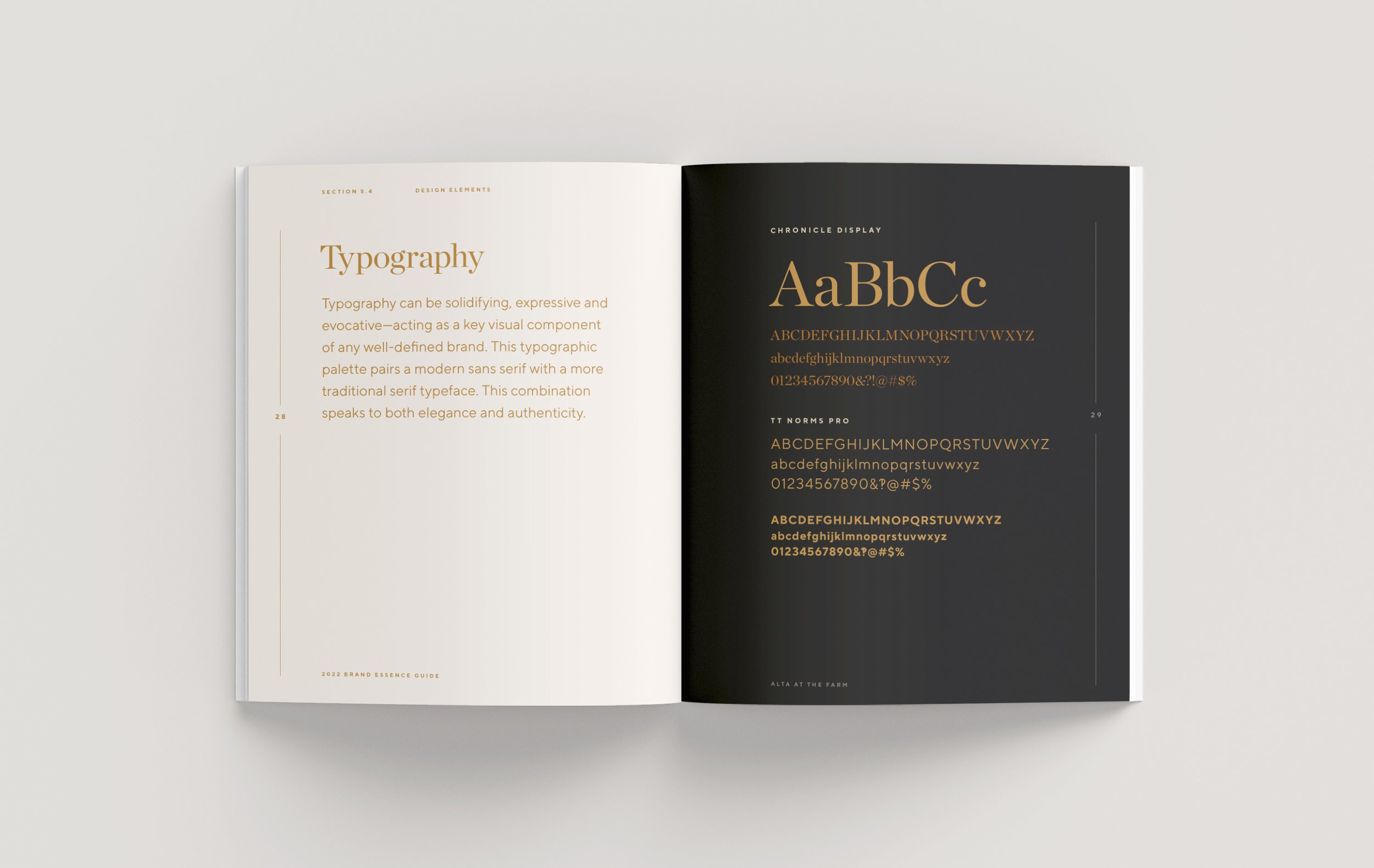
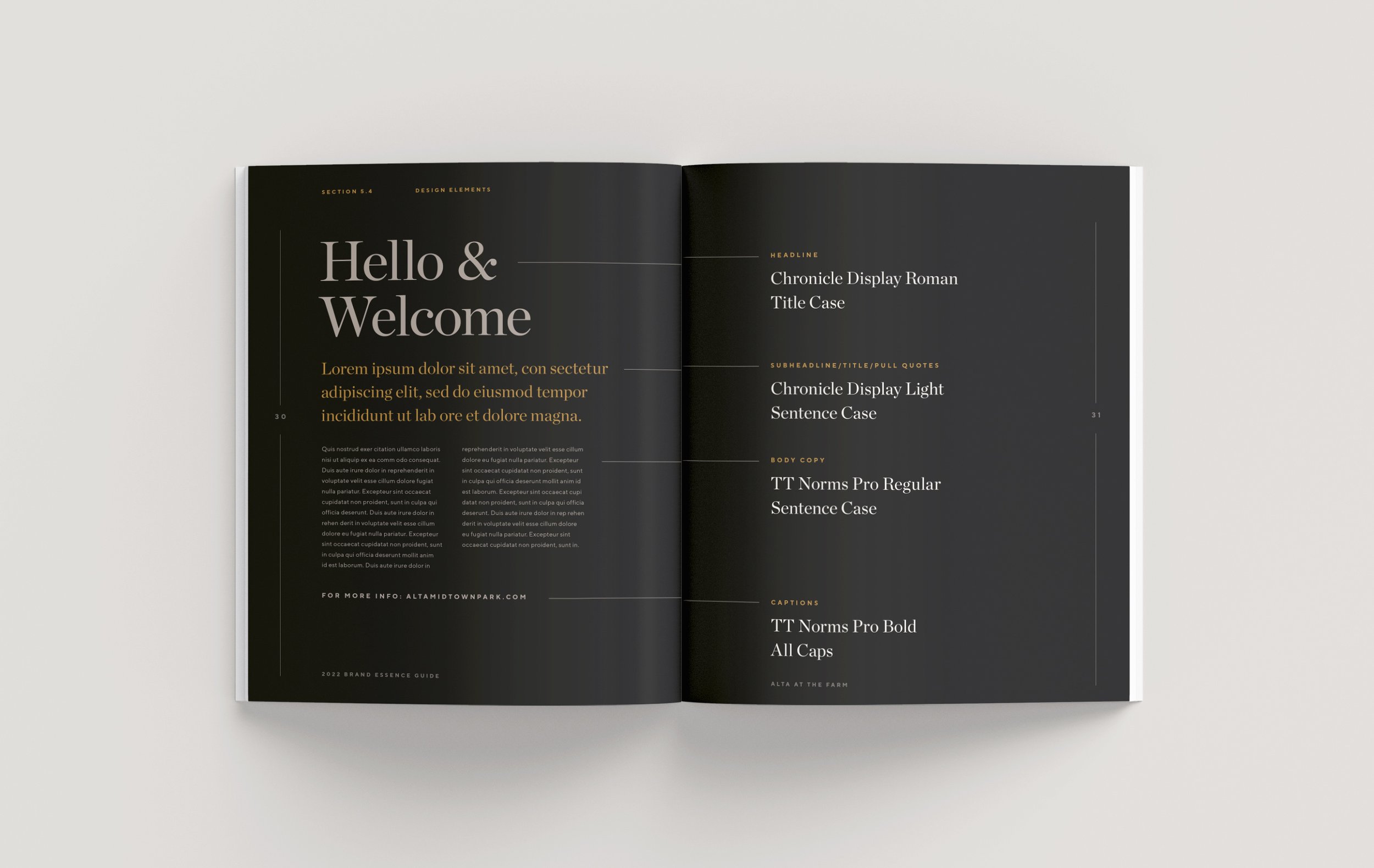
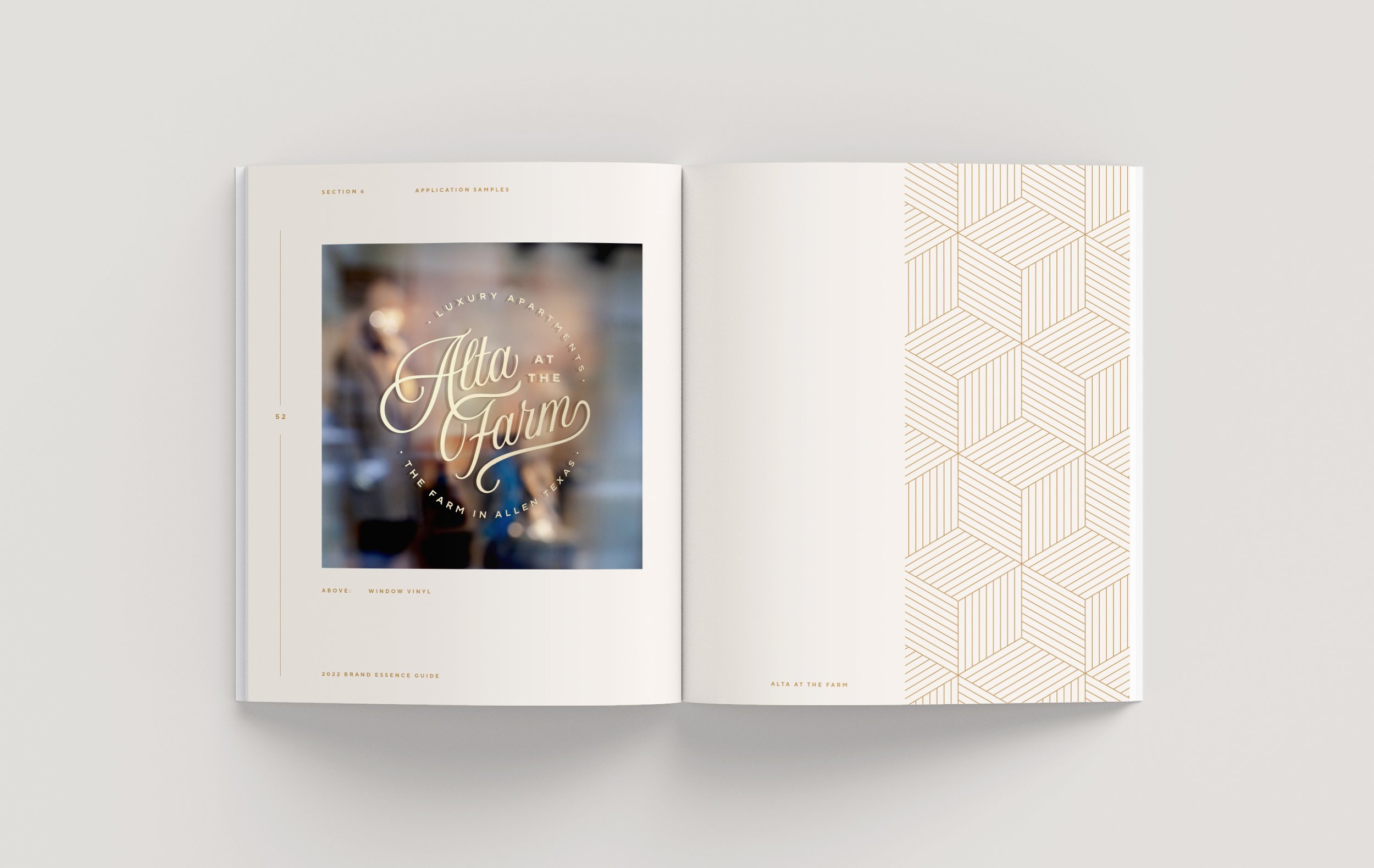
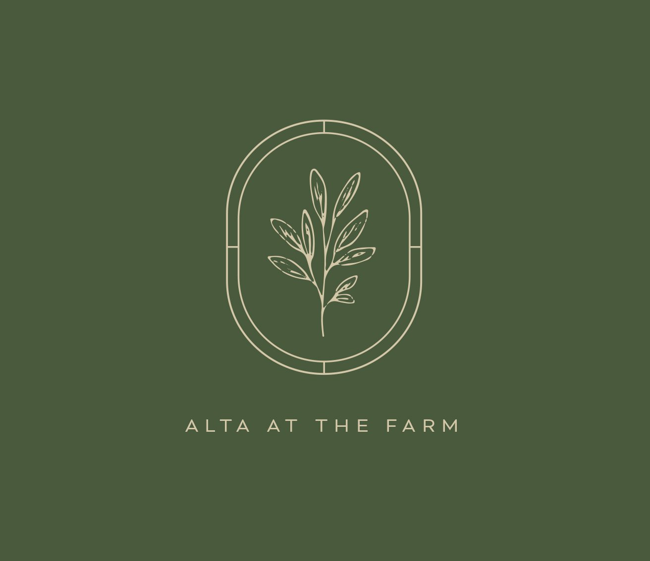
Both the identity system and color palette took its inspiration from the client’s Interiors Package. The organic, welcoming mark is partnered with a simple lockup, all of which are set against colors reflecting natural hues and tones. The colors and pattern are derivative of textiles throughout the lobby.


Alternate Options
Additional Option #2
Taking inspiration from the interior textiles and other client references, this similar identity leans towards a more modern, clean aesthetic. Subtly, it reflects several exterior details, and conceptually mimics a farm’s crop rows.

Additional Option #3
Admittedly inspired by the Farmer’s Market and Magnolia era, this direction explored a softer side that provided a lighter, more delicate approach than perhaps expected. It brings craftsmanship vibes, and reflects the boutiques found in The Farm community.

Above: One of many additional options that died along the way.