Apartment Branding Concepts
—
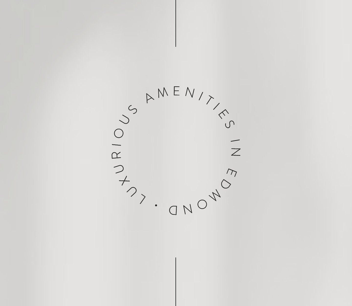
Several branding concepts for a new, mid-century modern apartment complex in Oklahoma. Built alongside Edmond’s historic train tracks, the architecture and interiors were inspired by 1950’s European travel and embraced delightfully vintage elements that influenced each brand concept.
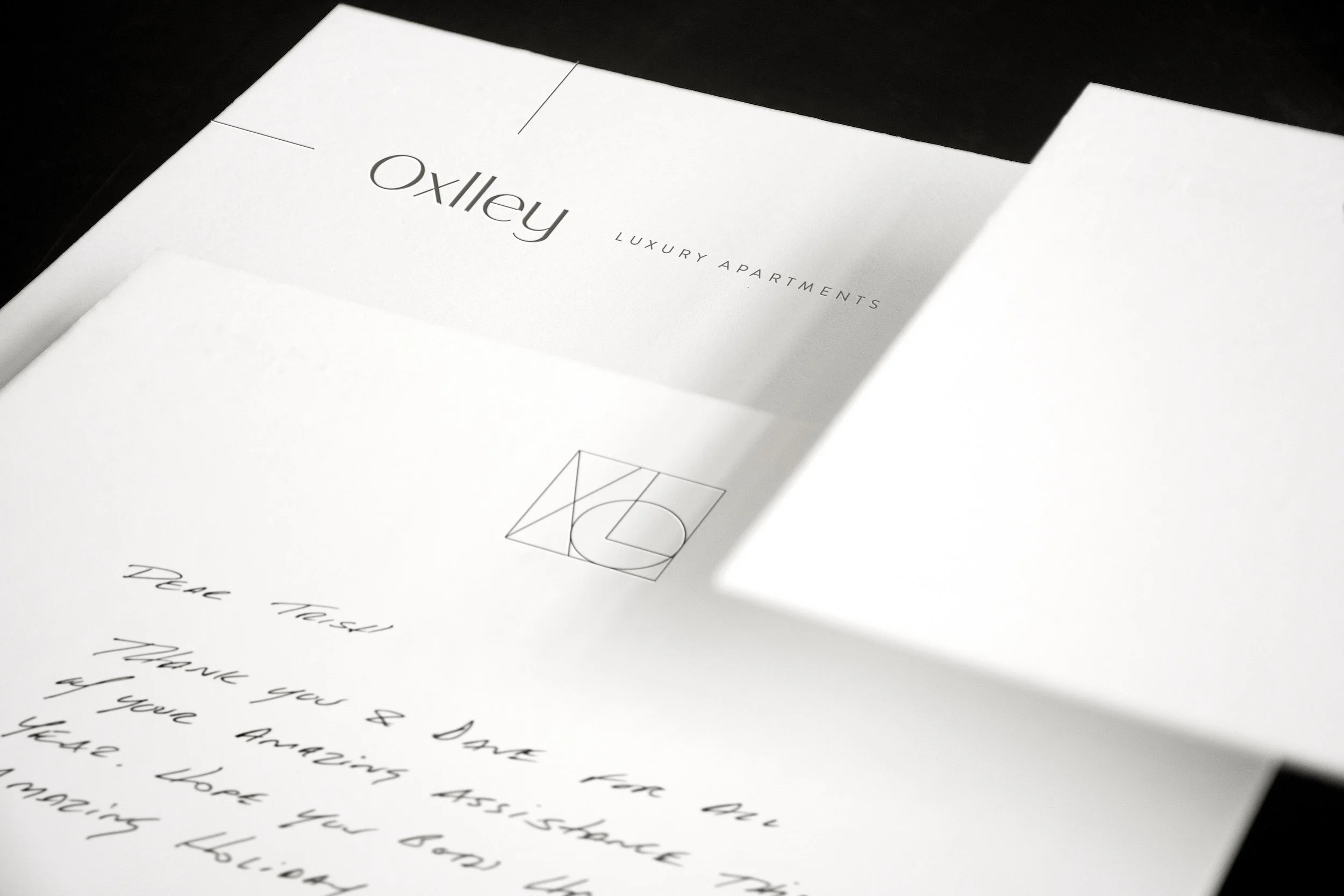
Concept #1
This mark echoes the split-flap lettering inspiration found throughout the lobby. Supportive graphics are inspired by train tracks that equally mimic common mid-century modern graphics, furniture, and decor. All color palettes are pulled from the interiors—including from paint colors, textiles, furnishings, and finishes.

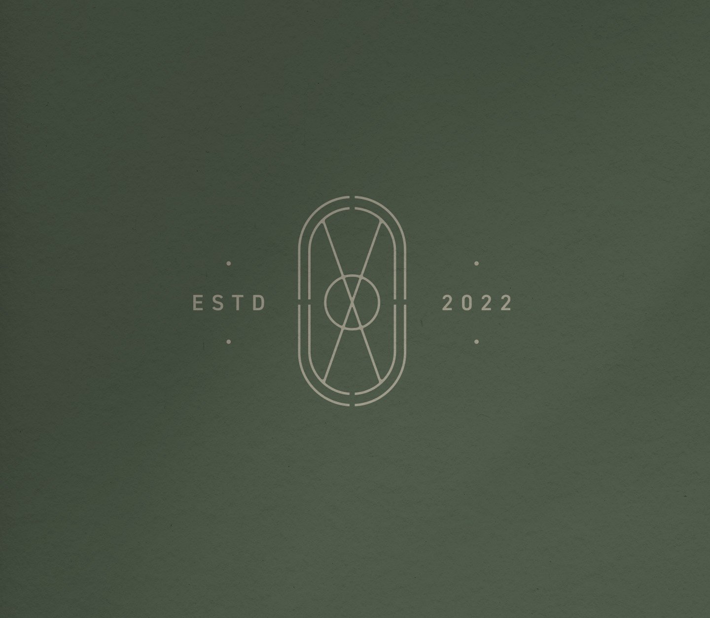


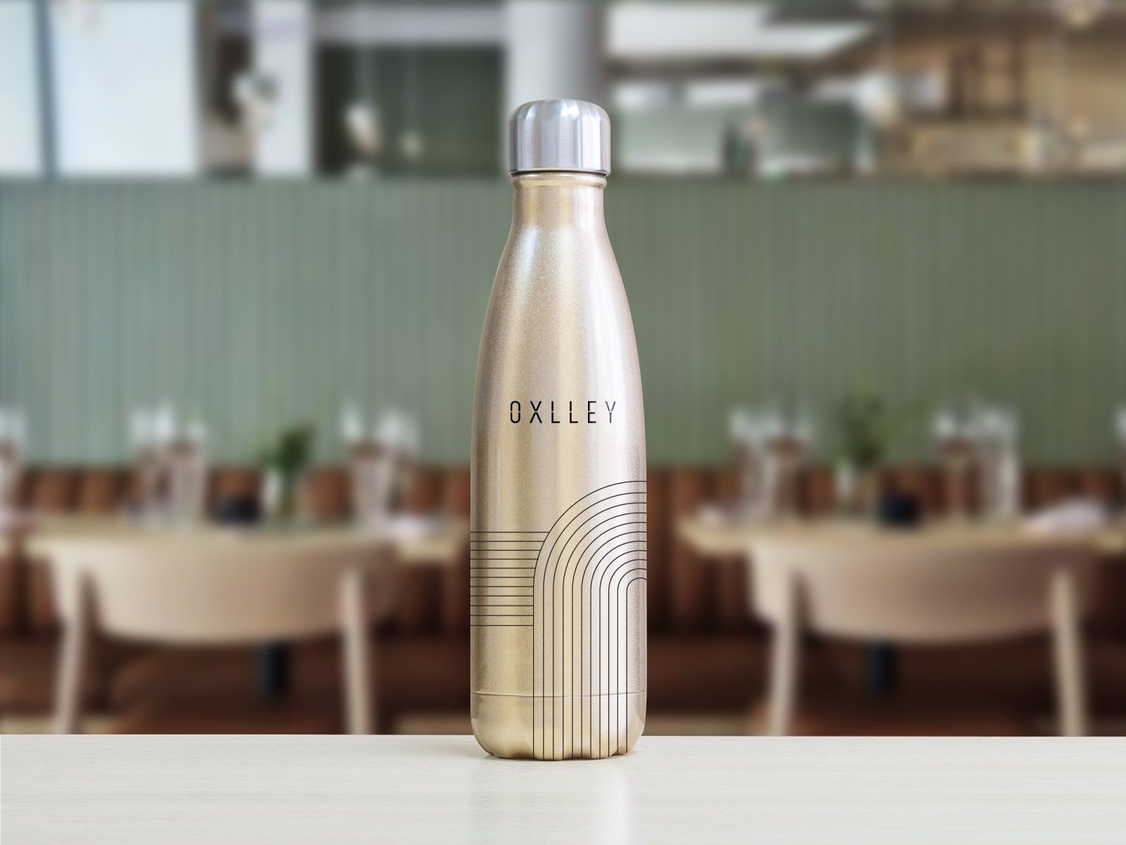
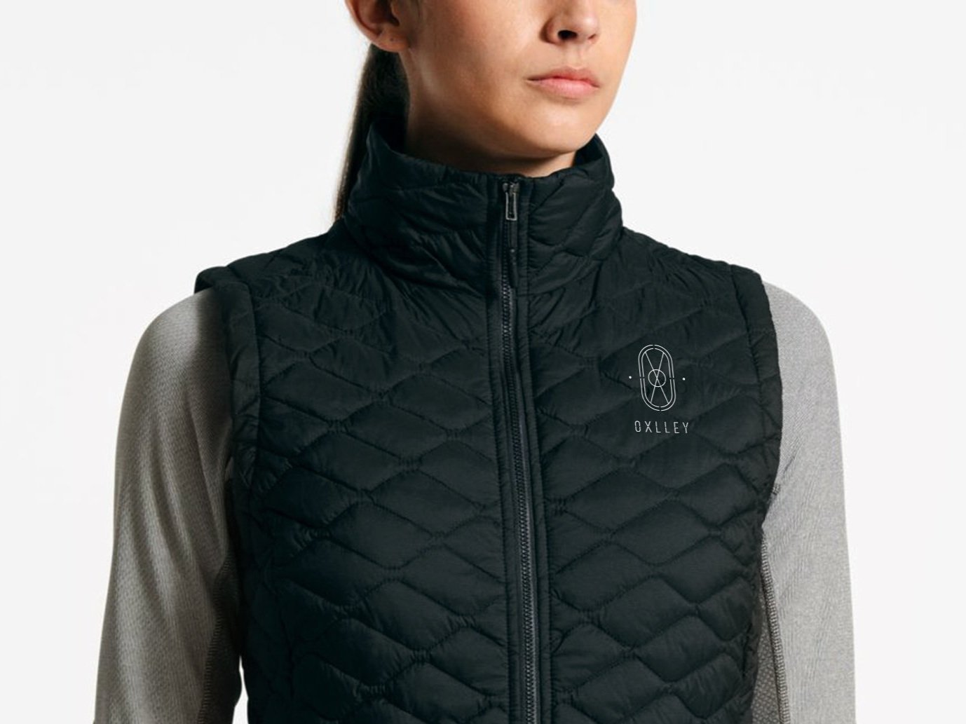

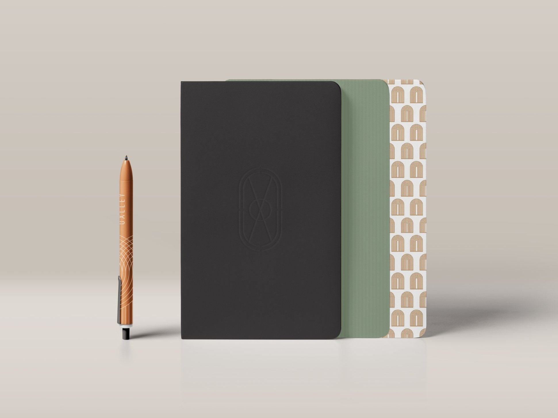


Concept #2
The colors and patterns of this concept are directly inspired by mid-century modern architecture and graphics. The logomark’s X derives from traditional railroad crossing signage, and the crossbar of the E mimics the wood sleepers tucked under the rails. It is simple and utilitarian in nature.


Concept #3
This logotype takes its inspiration from Cipe Pineles’ magazine typography of the era. The supportive logomark and graphics are a lighter interpretation of mid-century modern illustrations that aim to create a softer, more delicate look.


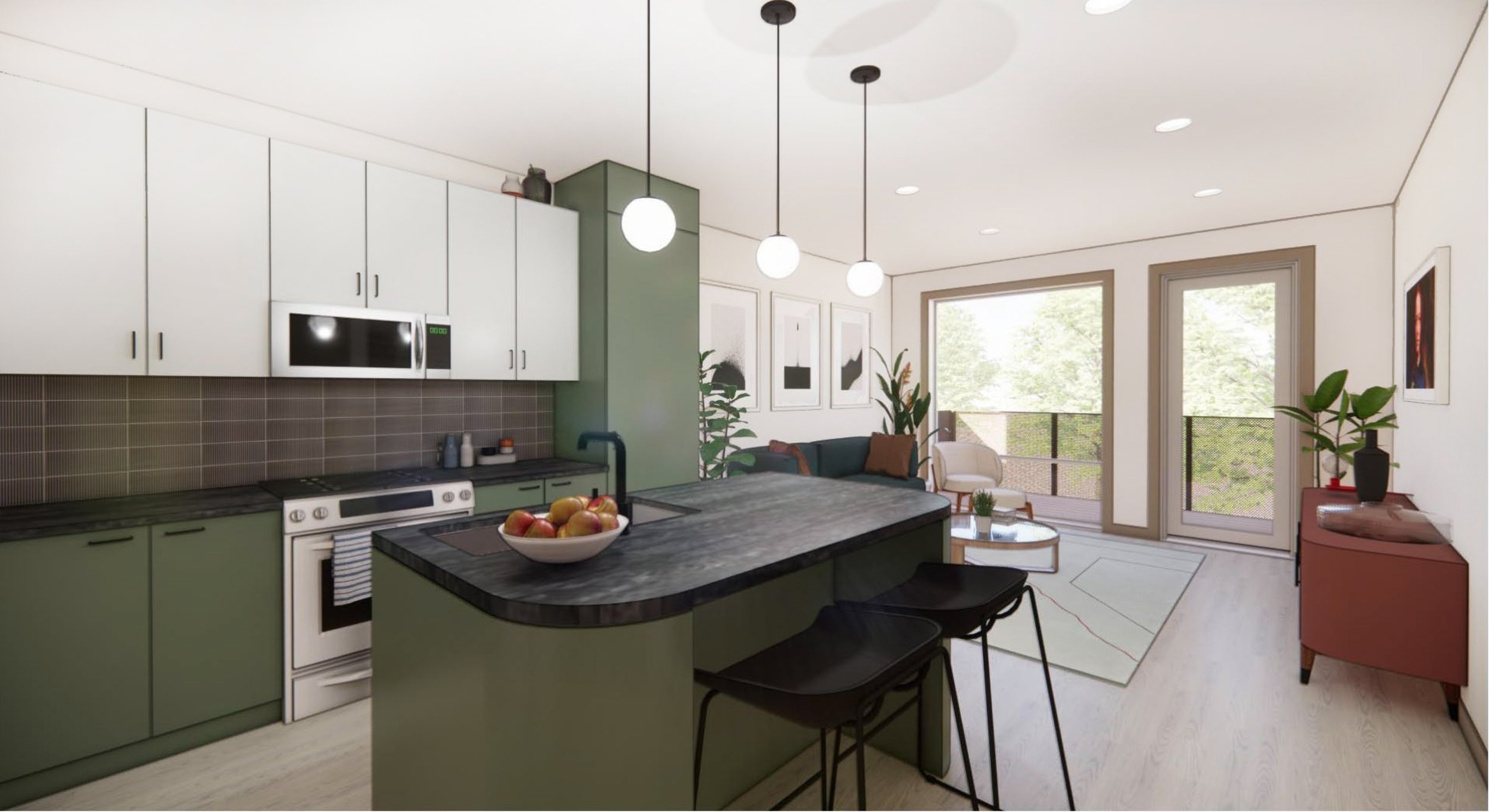
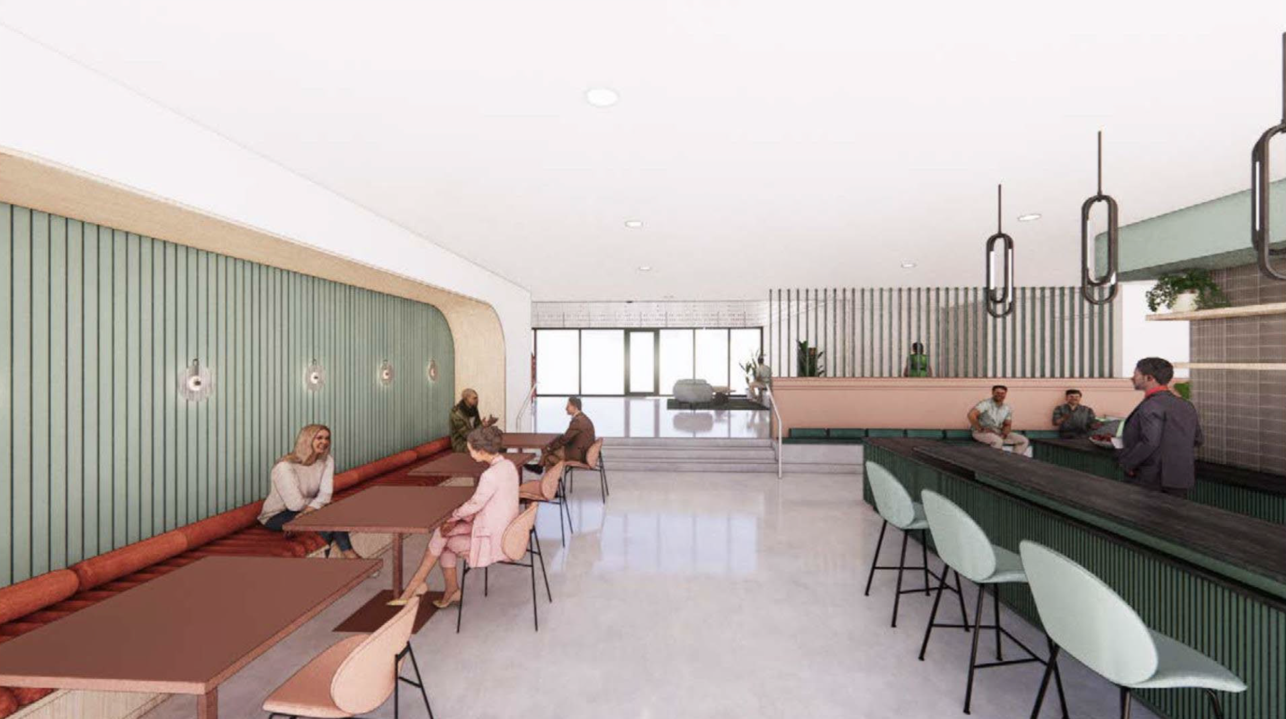
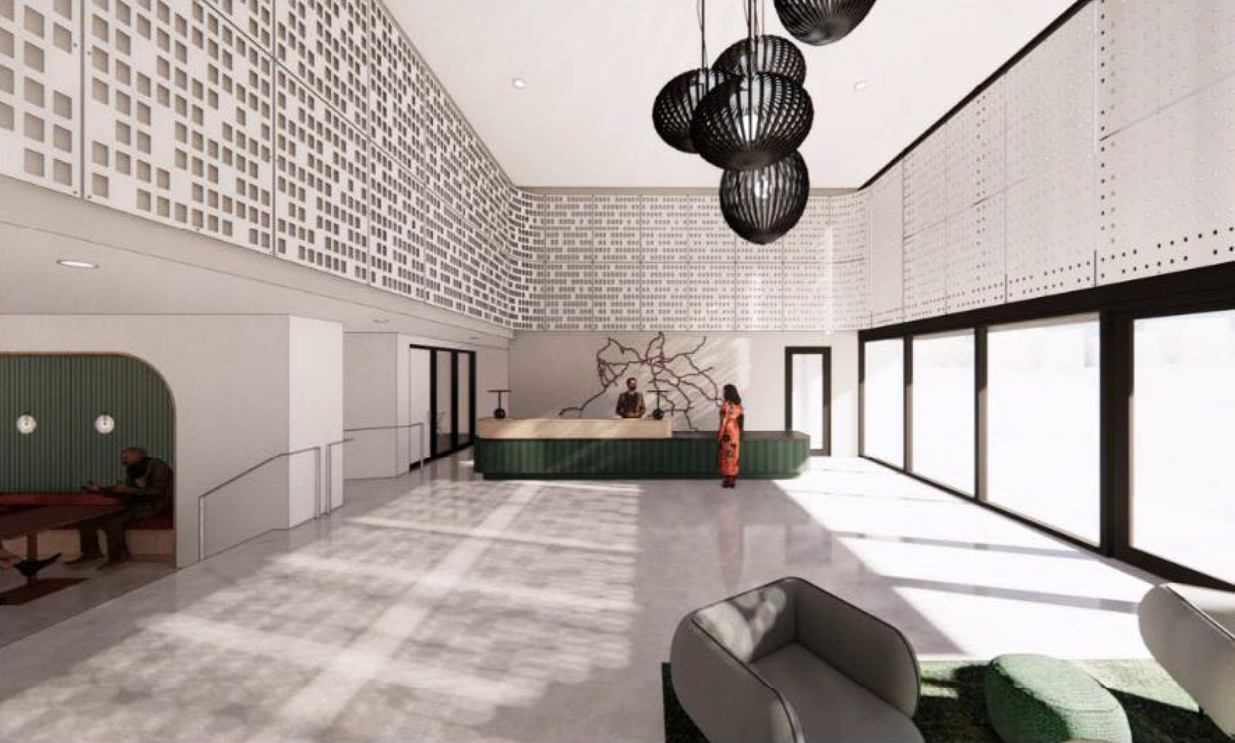
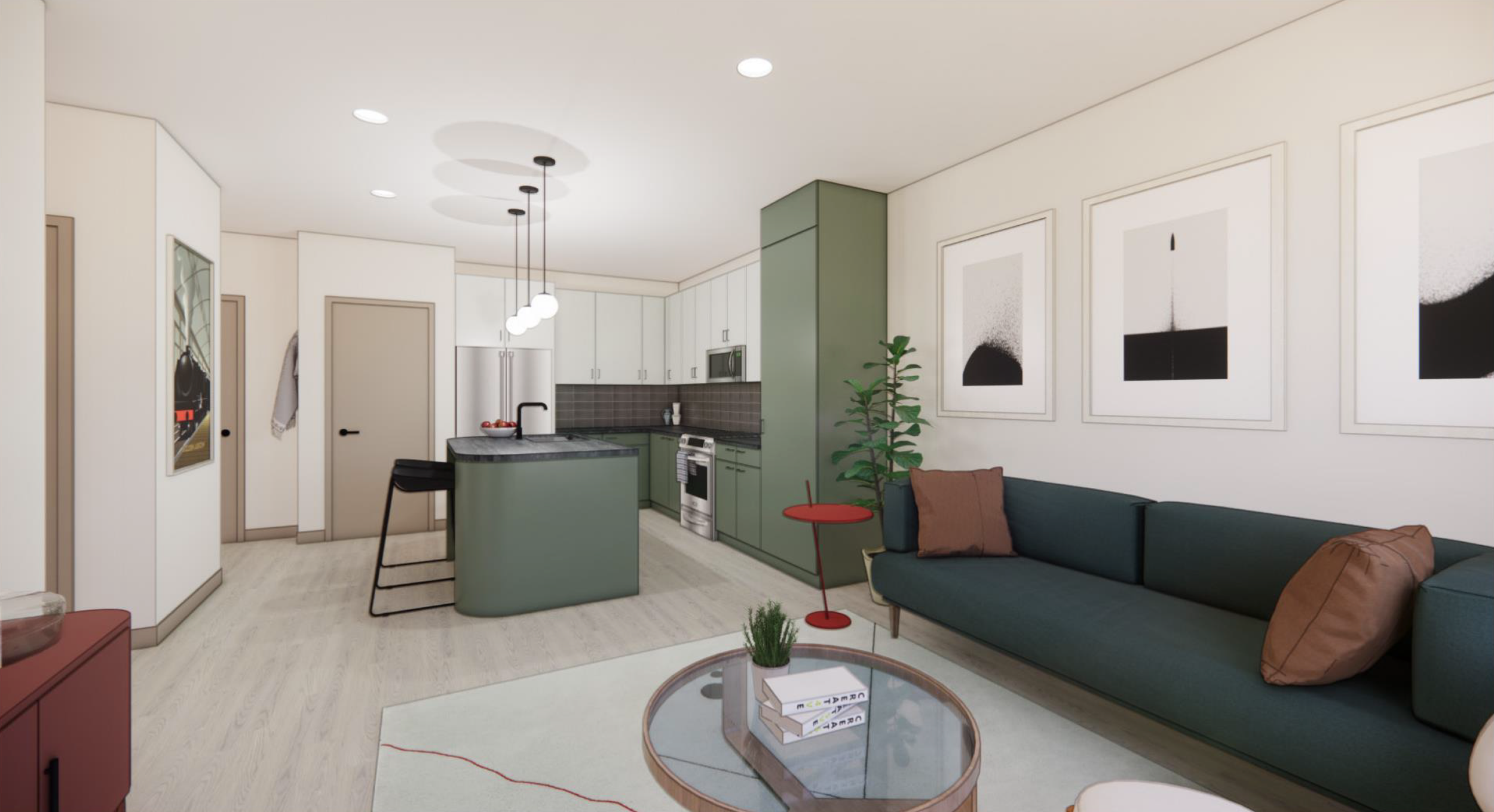
Renderings of the Apartment
This apartment complex was built alongside Edmond's historic train tracks, with architecture and interiors inspired by 1950s European train travel. The lobby features wall art inspired by vintage train split-flap displays, with a cafe and apartment renderings showcasing mid-century modern decor and finishes. Renderings were provided by Client.
—
Role: Art Director / Designer
Firm/Agency: The Brand Hatchery
Year of Project: 2022